Photo credit: User laughlin on flickr via photopin cc
Introduction
I’ve planned many webinars and attended a whole lot more. Webinars are a tried and true vehicle for communication, lead generation, training and more. That being said, the user experience could be even better. Let’s cover three features every webinar platform should consider adding.
1) Scrolling tickers.
If you’ve ever presented a webinar, you know that without fail, these two questions are asked every time:
“Will this webinar be available on-demand?”
“Will the slides be made available for download?”
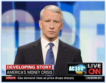
This information should be provided to viewers at the beginning of the program (or, throughout it) – NOT during the Q&A portion at the end. But how can this be accomplished? With a scrolling ticker placed within the webinar console (a la CNN, as shown above).
Pre-programmed ticker messages.
The ticker could be programmed with a set of messages to be run in rotation. With regard to the slides, the messages could be:
“The presenter’s slides are available in the ‘files’ folder [above]”
“Slides will be posted to our blog immediately after today’s webinar”
“Slides will be emailed to you right after today’s program”
You’d program a similar message with regard to the on-demand archive.
On-the-fly ticker messages.
Webinar planners (or moderators) could then submit ticker messages on the fly, providing comments in context to the presentation.
Examples:
Re-share a great quote the presenter just said
Remind viewers to submit questions
Invite viewers to visit the presenter’s web site
Invite viewers to visit your web site
2) Enhance the “Q&A Slide”

[Do I really need to stare at this for 25 minutes?]
Let’s say a webinar is 45 minutes long. The presenters complete their slides in 20 minutes and spend the next 25 minutes on Q&A. This means that the ending “Q&A slide” remains on the screen, unchanged, for 25 consecutive minutes!
This is a pet peeve of mine.
So here’s how to address this: dynamic slides. When presenters select a question to answer, they click an element in the presenters’ console. A new slide is rendered containing the question text. The webinar planner can choose a setting which determines whether the submitter’s name is shown next to the question.
Now, as viewers join the webinar in the middle of a presenter’s answer, they’re able to see the precise question being answered. Use this with the “on the fly” ticker messages and your Q&A session just got 200% more effective.
3) Copy SportsCenter’s rundown graphic.
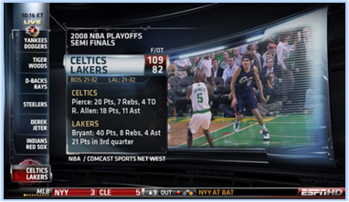
In 2007, according to Wikipedia, ESPN’s SportsCenter introduced a “rundown” on the right side of the screen (later moved to the left). The rundown listed, from bottom to top, the upcoming highlights (or stories). If you see your team’s highlights listed in the rundown, you’ll stick around and wait to see it, thus keeping you viewing SportsCenter longer.
I’m NOT suggesting that a webinar rundown simply list the heading of each slide, a la the slide outline in PowerPoint. Instead, presenters should be asked to map out the primary segments of the webinar. And it’s these segments that should be listed in a rundown.
In a live webinar, the idea is to interest viewers in subsequent segments (to keep them around). In the on-demand archive, the rundown segments are clickable, allowing viewers to navigate directly to that segment.
Conclusion
OK, so perhaps these features aren’t as simple to implement as I might think. But they are powerful. Add these three features to your platform and I guarantee that your customers will produce more effective webinars.